Paid search campaigns generate immediate traffic, yet traffic alone does not deliver results. Instead, performance depends on how effectively a landing page captures intent and guides visitors toward action. Therefore, high-converting landing pages focus on clarity, relevance, and momentum rather than visual noise or broad messaging. When each section answers a specific user question, paid clicks turn into measurable outcomes instead of wasted spend. Landing pages play a strategic role in campaign success because they sit between promise and proof. As a result, businesses that treat landing pages as conversion tools rather than design assets consistently achieve stronger lead quality and lower acquisition costs.
Understanding Intent Behind Paid Search Clicks
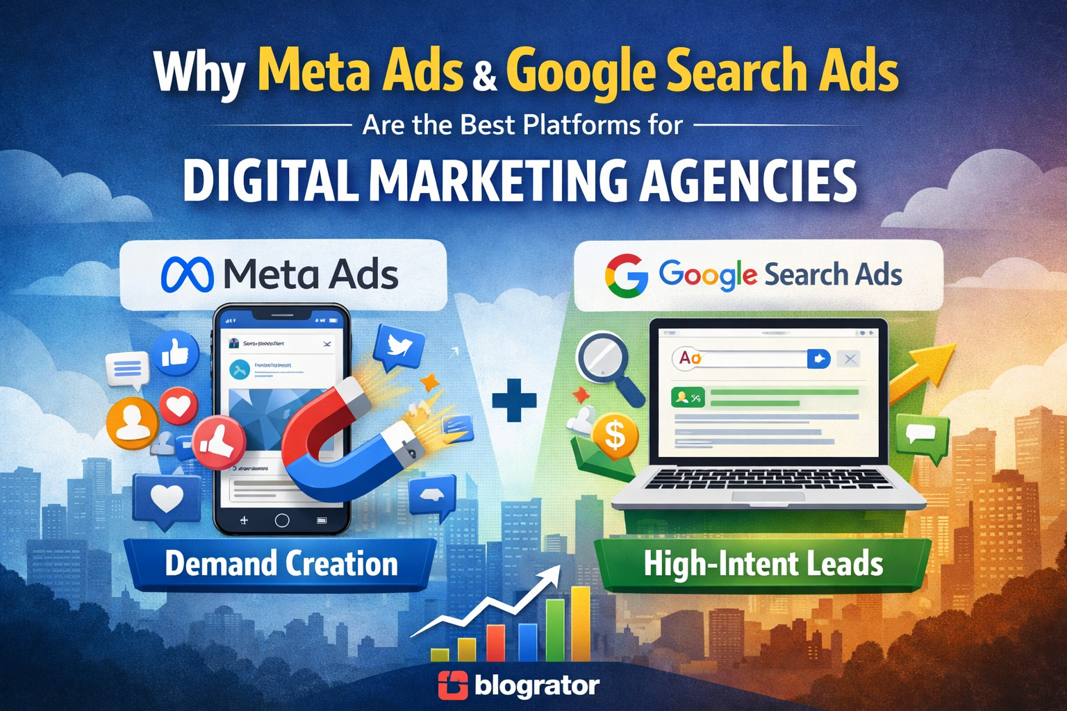
Every paid search click carries intent shaped by the exact keyword phrasing, the promise made in the ad, and the user’s situation at that moment. Consequently, a landing page must reflect that intent immediately, because the visitor starts “judging” in the first few seconds. When visitors see familiar language and aligned outcomes, they stay engaged longer, and they feel confident that they landed in the right place. Moreover, intent changes by funnel stage, so a “pricing” search expects clear cost signals, while a “services near me” search expects location confidence and quick contact options. Therefore, you should match the page headline, subheadline, and first proof block to the same expectation your ad created, so users do not feel any disconnect.
Searchers who click ads usually want direct solutions, not exploration, because they have already chosen a specific option from a list of competitors. Therefore, landing pages should remove unnecessary choices and focus on one clear objective, such as a form submission, a call, or a booking request. Additionally, you should avoid sending visitors into a maze of menus and unrelated pages, because distraction increases drop-offs and weakens conversion rates. By addressing intent first, the page builds confidence and reduces hesitation, and it helps visitors move forward without second-guessing. Learn more about GoHighLevel Landing Page Design for High Conversions.
Structuring Pages for Fast Decision-Making
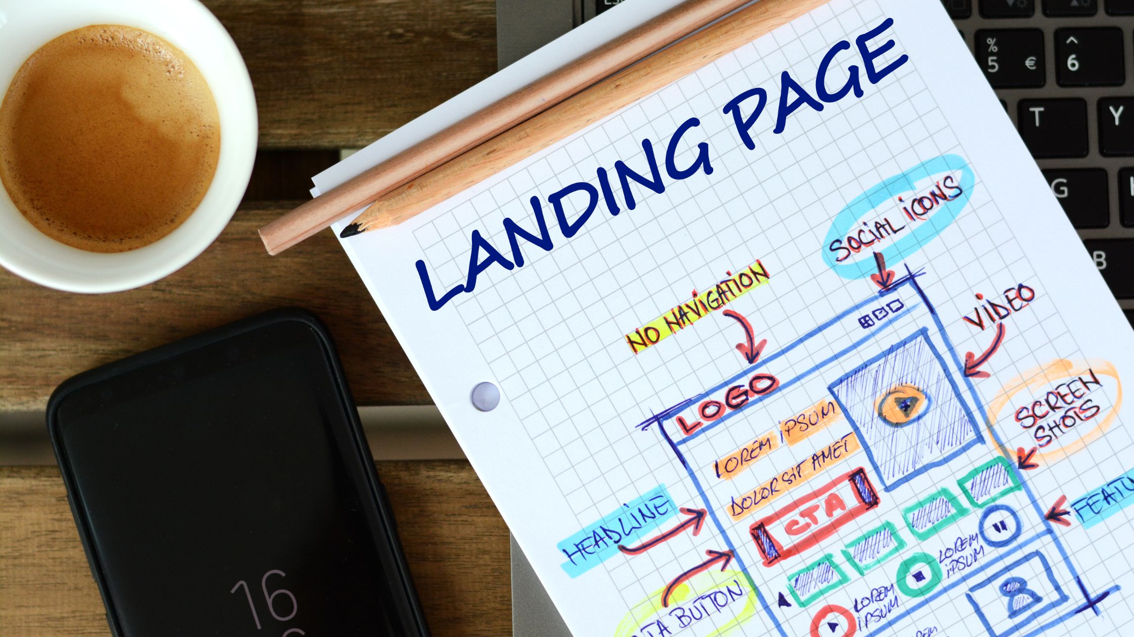
High-converting pages follow a logical flow that mirrors how people decide under time pressure. First, the page establishes relevance, so the visitor instantly knows they are in the right place. Next, it confirms credibility, so the visitor feels safe trusting the message.
- A clear headline that states the outcome: You should state the main result in simple language, so visitors understand the benefit at one glance.
- A supporting explanation that adds context: You should explain who the offer fits and how it works, so visitors feel clarity without reading long paragraphs.
- A problem-solution narrative that feels familiar: You should describe the common pain points and your direct fix, so visitors feel understood and stay engaged.
- Proof elements that validate claims: You should add testimonials, numbers, screenshots, or short case outcomes, so visitors trust the promise quickly.
- A focused call to action: You should use one primary action with clear wording, so visitors take the next step without hesitation.
Additionally, this structure prevents overload and keeps attention moving forward, because each section answers one specific question at the right time. Moreover, it reduces decision fatigue by limiting distractions and keeping the page goal consistent from top to bottom.

Landing Page Elements That Lift Paid Search Results
Paid search visitors decide fast, so the landing page must deliver clarity without delay and without distractions. Therefore, the elements below reduce drop-offs, improve confidence, and increase qualified actions more consistently.
A) Offer Clarity
First, the core offer appears in one sharp sentence for instant understanding and quick relevance. Next, the page explains who it fits and what the visitor receives today with simple, concrete terms. As a result, vague language disappears, and decisions feel easier, safer, and more predictable.
B) One Focused CTA
Most importantly, one primary action keeps the page tightly goal-driven and removes mixed signals. Then, the CTA repeats at natural decision points across the page flow, especially after proof blocks. Consequently, specific button text removes hesitation, sets expectations, and drives quicker clicks.
C) Proof and Trust Signals
Additionally, testimonials, outcomes, or real examples reduce perceived risk fast and build immediate reassurance. Meanwhile, credibility near the top builds trust before doubt starts rising or comparisons begin. Therefore, relevant proof makes the promise feel realistic, believable, and worth acting on.
D) Friction-Free Forms
To begin with, fewer form fields keep completion rates consistently higher, particularly on mobile traffic. After that, a clear “what happens next” line improves comfort, clarity, and user confidence. As a result, mobile-friendly inputs make submissions feel quick, simple, and genuinely effortless.
E) Speed and Readability
Moreover, faster loading prevents paid clicks from bouncing away too early, especially on slower networks. At the same time, short sections and scannable text support faster reading and clearer understanding. Ultimately, clean spacing guides attention forward, reduces fatigue, and strengthens conversions.
In summary, these five elements work together to protect ad spend and lift results over time. Consequently, campaigns gain stability, stronger lead quality, and better conversion performance month after month.
Quality Control Checklist Before You Launch the Page
Before launch, a quick quality check prevents wasted spend and avoidable conversion leaks.
- Message Match — Confirm headline mirrors ad promise and keyword intent.
- Mobile Experience — Check layout, taps, forms, and readability on phones.
- Speed Readiness — Verify fast load time and no heavy, broken assets.
- Tracking Setup — Validate pixels, events, and thank-you goals fire correctly.
- CTA Clarity — Ensure one primary CTA repeats consistently and stays visible.
After you verify these five items, you can launch with confidence and cleaner performance data.

Conclusion
High-converting landing pages succeed because they respect intent, reduce friction, and guide decisions with clarity. Instead of acting as static designs, they function as active conversion tools within paid campaigns. When strategy, structure, and tracking work together, performance improves consistently. Businesses seeking a disciplined, system-driven approach to landing page creation for paid search campaigns benefit from partners who understand both design and conversion logic, such as. Blogrator Web Service.