In today’s digital landscape, mobile devices have overtaken desktops as the preferred method for accessing websites. This shift has made mobile-first web design a crucial strategy for businesses looking to optimize user experience, capture leads, and drive conversions. But what exactly is mobile-first web design, and why is it so important for lead generation? Let’s explore this essential approach to building websites that not only look great on mobile but are also designed to engage users and turn them into loyal customers.

What is Mobile-First Web Design?
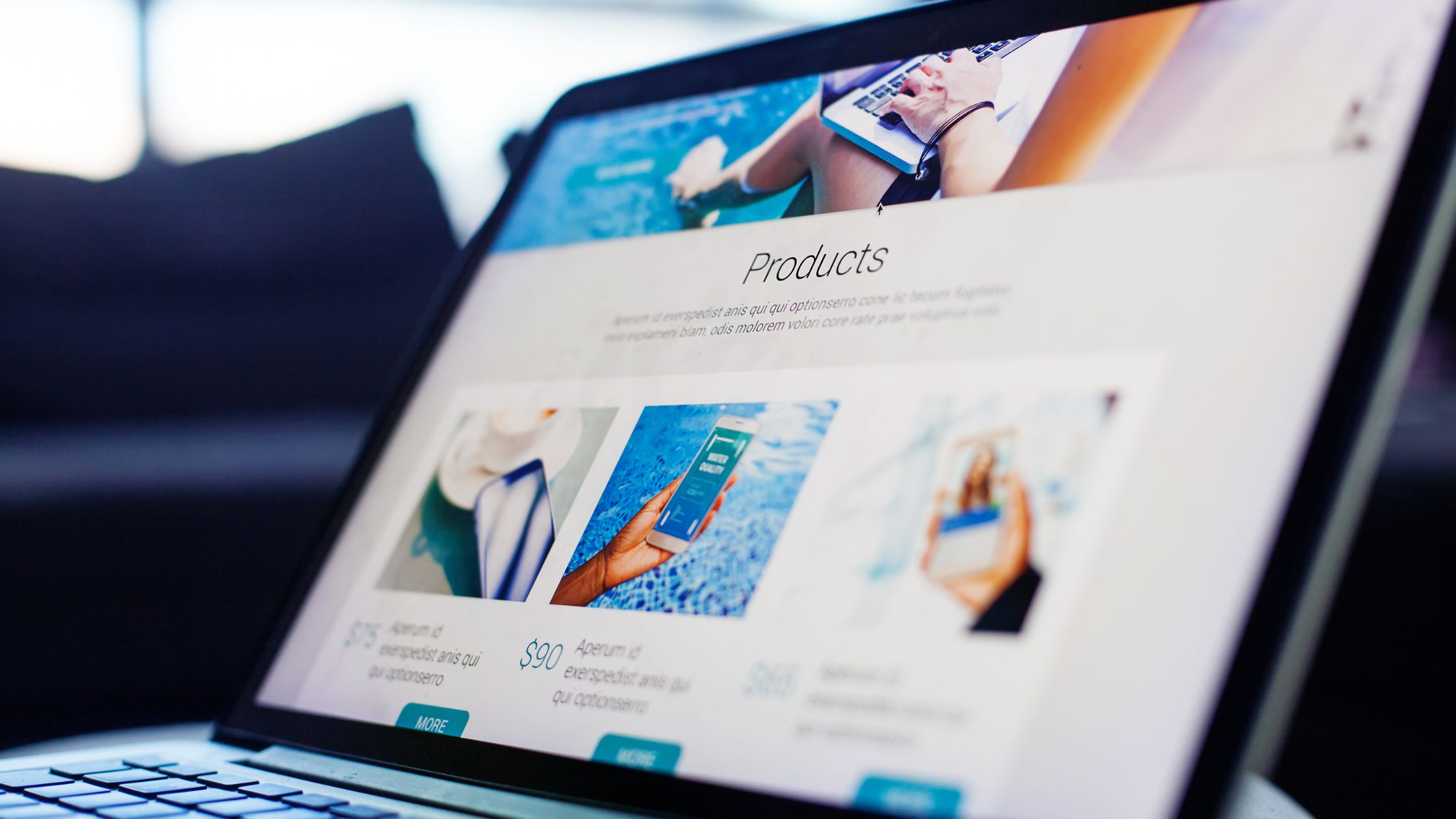
Mobile-first web design is an approach where websites are initially designed and optimized for mobile devices, then adapted to larger screens, such as tablets and desktops. This method prioritizes mobile user experience by focusing on fast loading times, simplified navigation, and clear, easy-to-use interfaces. As more people browse websites on smartphones and tablets, mobile-first design ensures that your site meets users where they are, making it essential for businesses looking to generate and capture leads effectively.
Why Mobile-First Web Design Matters for Lead Generation
A mobile-first approach ensures the best user experience, regardless of device. For lead generation, this means quicker load times, easy navigation, and a smooth journey from visit to conversion. Here’s why mobile-first design is crucial:
- Enhanced UX: Clean, mobile-first layouts reduce clutter, help users find info faster, and keep them on-site longer.
- Faster Load Times: Speed-optimized pages load quickly, cutting drop-offs and boosting form fills/purchases.
- Increased Conversions: Mobile-friendly CTAs and lead forms make it easy to take action, improving conversions.
- Higher Engagement: Better mobile experience drives more reading, video views, and newsletter sign-ups—creating more leads.
In short, mobile-first design improves experience, speed, and clarity—so visitors don’t just browse, they convert. When your site feels effortless on mobile, trust grows, and leads follow.
Key Elements of a Mobile-First Design for Lead Generation
To effectively use mobile-first web design for lead generation, there are several critical components you should consider:
A. Responsive Design
Responsive design ensures your website adapts seamlessly to various screen sizes and orientations. This ensures an optimal experience across all devices, from smartphones to desktops, making your site user-friendly and accessible no matter what device visitors use.
B. Simple and Clear Navigation
Simplicity is crucial for mobile-first design. Visitors should quickly find key information without unnecessary distractions. Streamlined navigation and a clear focus on important actions—such as filling out forms, subscribing to newsletters, or making inquiries—will improve user experience and encourage engagement.
C. Fast Loading Speed
Mobile users expect fast, responsive websites. Research shows that if a page takes more than 3 seconds to load, users are likely to abandon it. Mobile-first web design reduces loading times by optimizing images, compressing files, and eliminating unnecessary elements, ensuring a smoother experience and reducing bounce rates.
D. Optimized Lead Capture Forms
Lead capture forms are essential for conversions. On mobile devices, these forms must be short, easy to fill out, and accessible. Minimize the number of fields and make buttons large enough for easy tapping to ensure a hassle-free experience for visitors.
E. Clear Call-to-Action (CTA)
A strong, easily visible CTA is essential for converting visitors into leads. Whether it’s a “Contact Us” button or “Get Started” form, your CTA should stand out and be easy to click, guiding users from interest to action seamlessly.
By focusing on these elements, mobile-first design ensures an engaging, conversion-friendly experience.

Benefits of Mobile-First Web Design for Lead Generation
A mobile-first website isn’t just about looking good on phones—it directly impacts how people find you, trust you, and take action.
1) Improved SEO
Google’s mobile-first indexing means that the mobile version of your website is used to determine rankings. Mobile-optimized websites have a better chance of ranking higher in search engine results, resulting in increased visibility, more traffic, and ultimately, more leads.
2) Increased Reach
With the majority of internet users browsing on mobile devices, having a mobile-first website increases your reach. You’ll ensure that your website is accessible to the largest audience possible, providing a better chance for generating quality leads.
3) Better Customer Retention
An optimized mobile site makes it easier for customers to engage and stay connected with your brand. This improved experience increases the likelihood that visitors will return, engage further, and convert into leads over time.
4) Competitive Advantage
With many businesses still focused on desktop-first designs, adopting a mobile-first approach gives you a competitive edge. Customers appreciate a site that works seamlessly on their devices, and a mobile-friendly design sets you apart from competitors who haven’t yet optimized their sites for mobile.
In short, mobile-first design helps you get discovered faster, serve more people, and convert them with less friction—giving your brand a clear edge. Learn more about Custom Web Development Services.
Challenges of Mobile-First Web Design
While mobile-first design offers numerous advantages for lead generation, there are a few challenges to consider:
- Content Prioritization: Since mobile screens are smaller, it’s essential to prioritize content carefully. Decide which information is most important to visitors and highlight it.
- Complexity in Design: Designing for both mobile and desktop is tricky because you must balance usability, features, and visuals across different screen sizes.
When you plan content clearly and design with flexibility, you create a smooth experience on every device—without confusing or overwhelming users.

Conclusion
Mobile-first web design isn’t just a passing trend; it’s a crucial strategy for businesses looking to generate leads in today’s mobile-driven world. As more and more people rely on their smartphones to browse and shop, businesses that prioritize a mobile-first approach are seeing better user experiences, faster load times, and higher conversion rates. By keeping things simple, clear, and efficient, you can create a website that grabs the attention of mobile users and turns them into valuable leads. Embrace mobile-first design to set your website up for success and stay ahead of the competition. Need help bringing your vision to life? At Blogrator Web Service, we specialize in creating custom web designs that work for your business. Let’s get started today!